Warwickshire Home Physio
A rebrand to align their brand with their growth ambitions.
A new chapter
Formerly Spiral Health, Warwickshire Home Physio is a growing team of specialist physiotherapists providing personalised care in the comfort of their client’s homes.
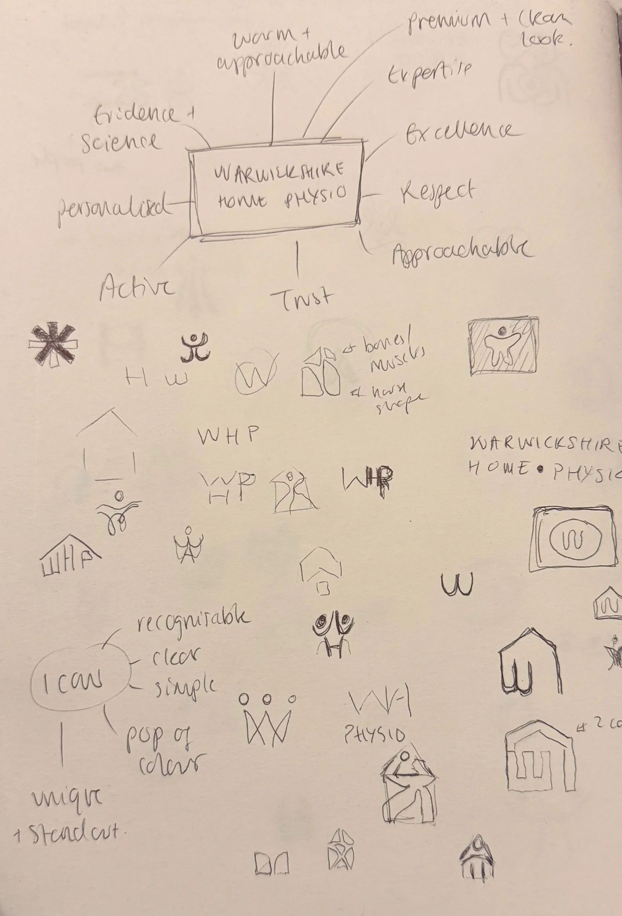
With an expanding team and ambitions for growth, they needed a fresh, modern identity that better reflected their expertise and quality of care. The challenge was to create a brand that felt professional, trustworthy and premium, while remaining warm, compassionate and approachable.
Designed with meaning
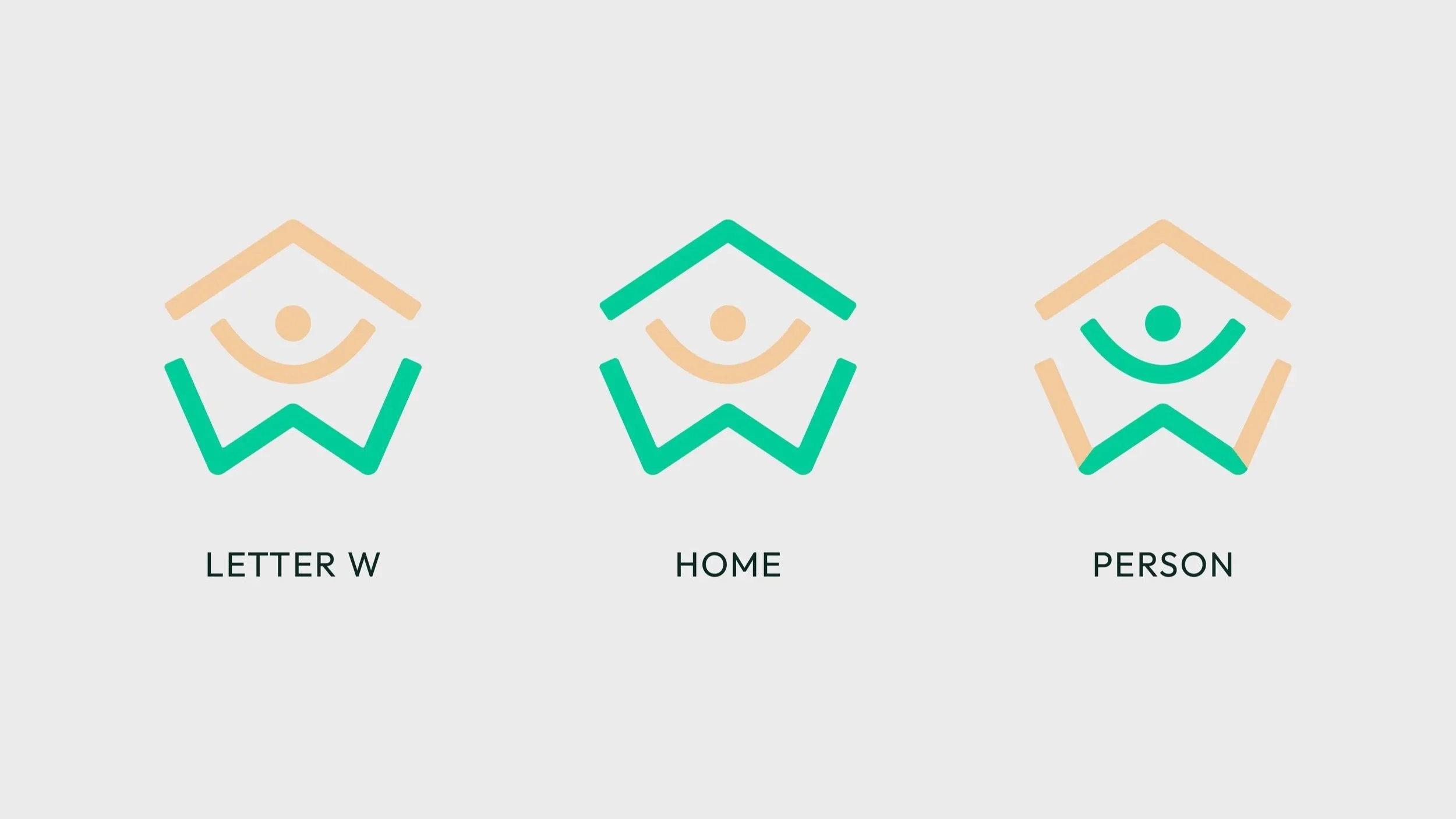
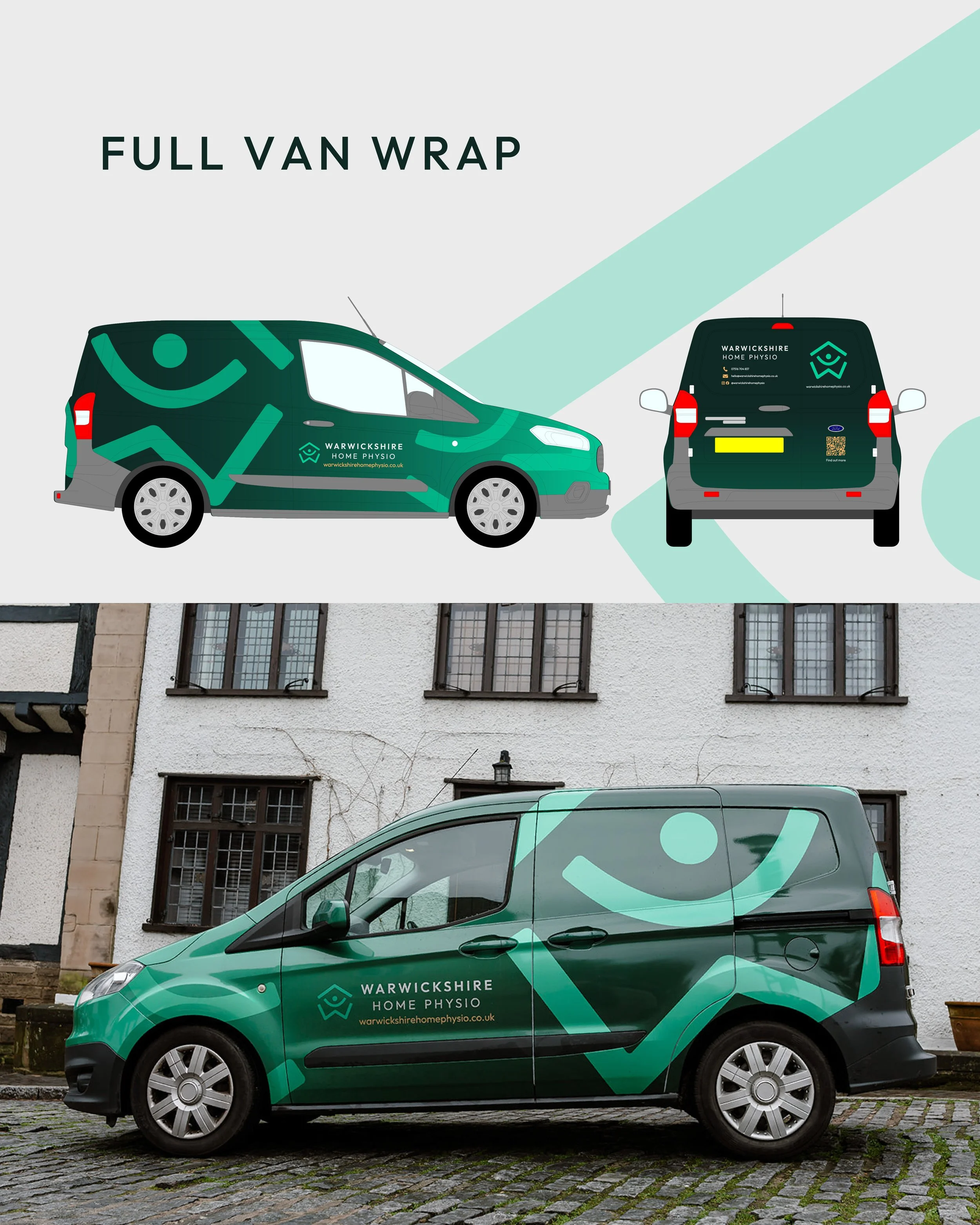
We created a bold, contemporary visual identity built around three key elements: home, movement and people.
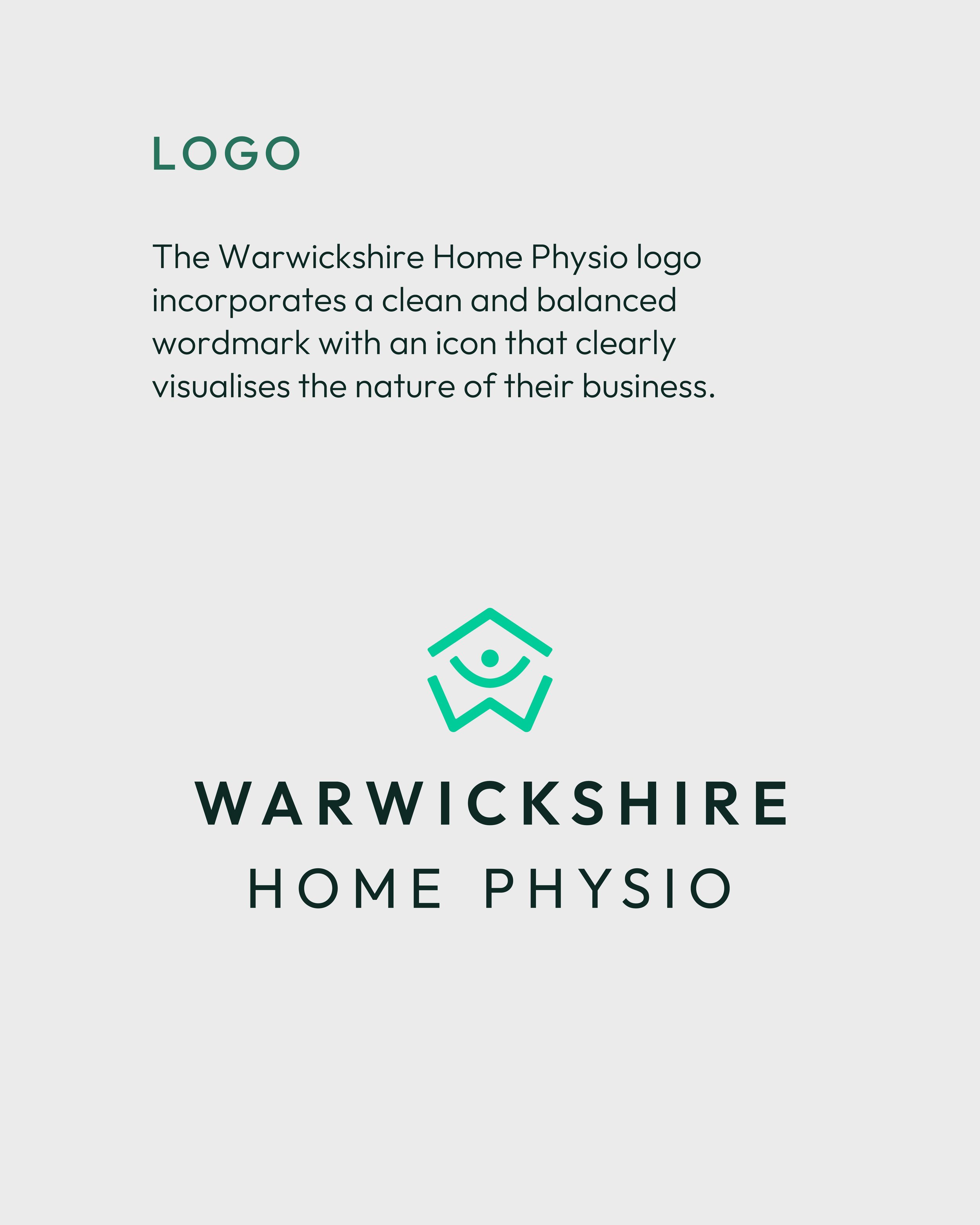
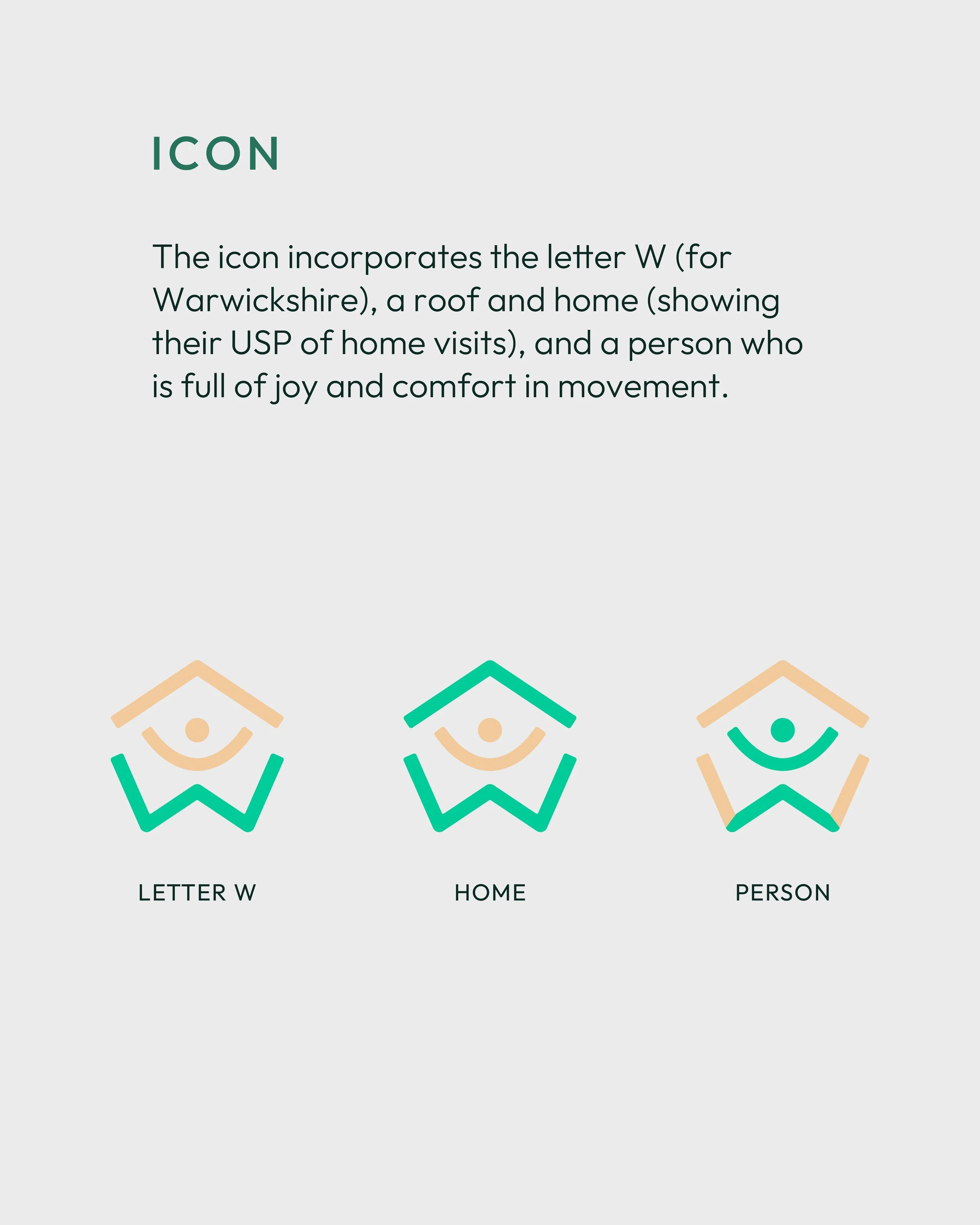
The distinctive icon combines the letter 'W' for Warwickshire, a roof representing their home-visit service, and a joyful human figure symbolising movement and wellbeing.
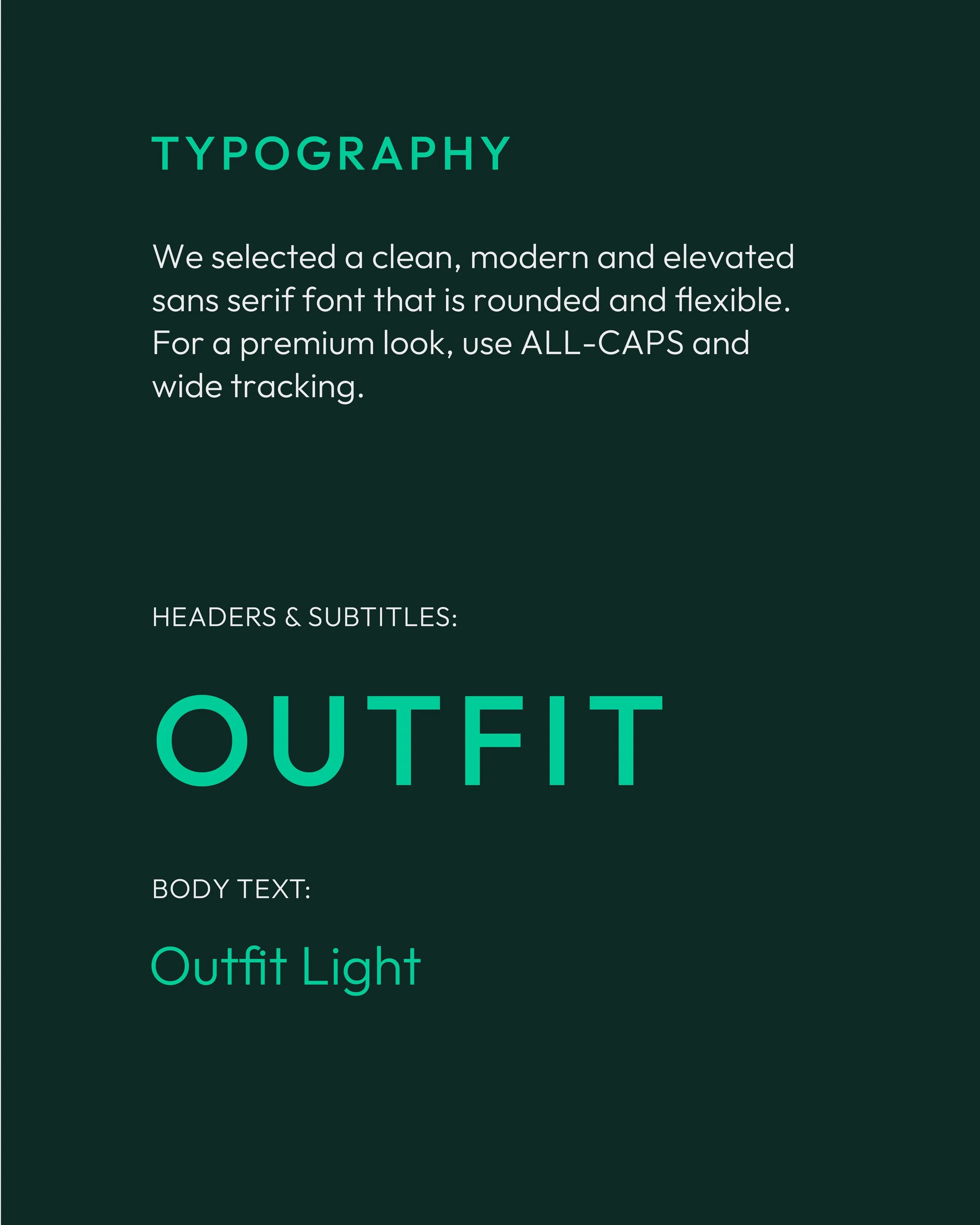
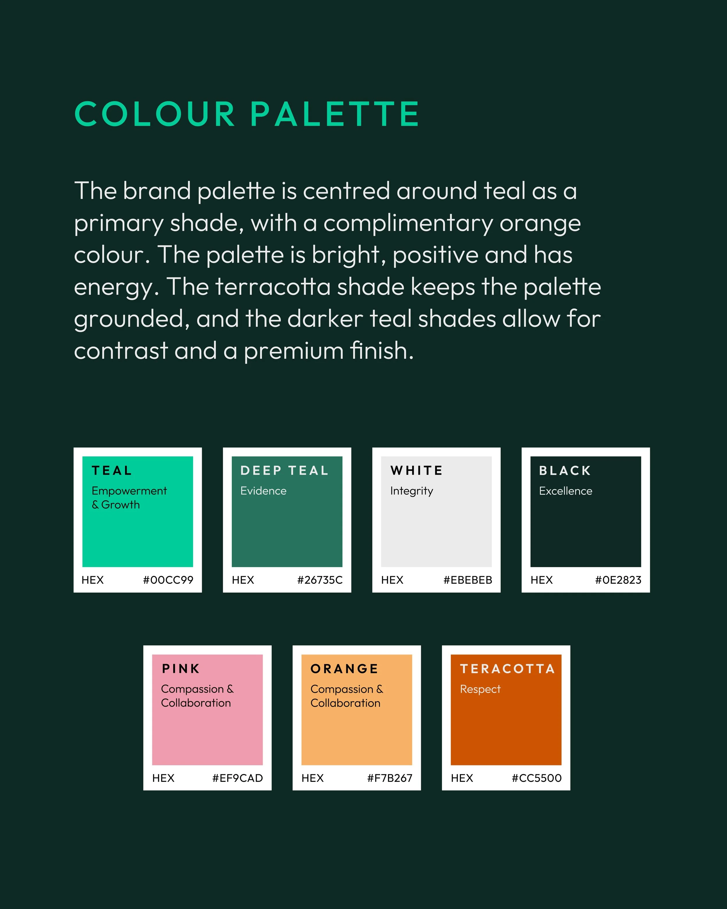
A vibrant teal brings energy and optimism, balanced with deeper greens for trust and professionalism. Warm accent colours and clean, contemporary typography complete a flexible, recognisable identity.
Bringing the brand to life
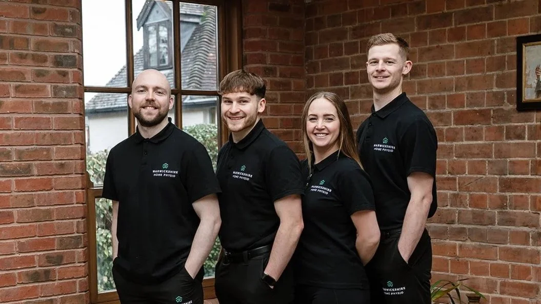
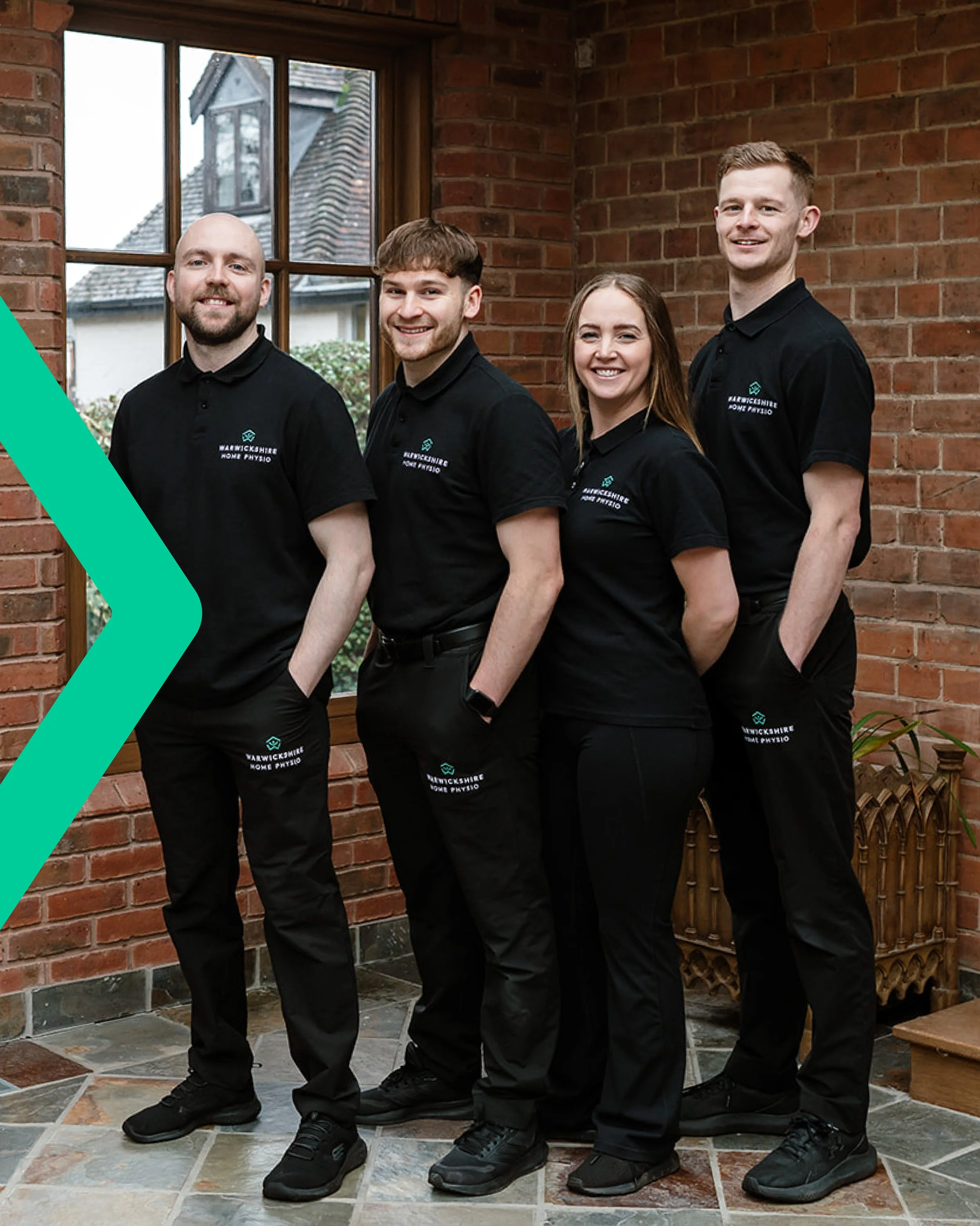
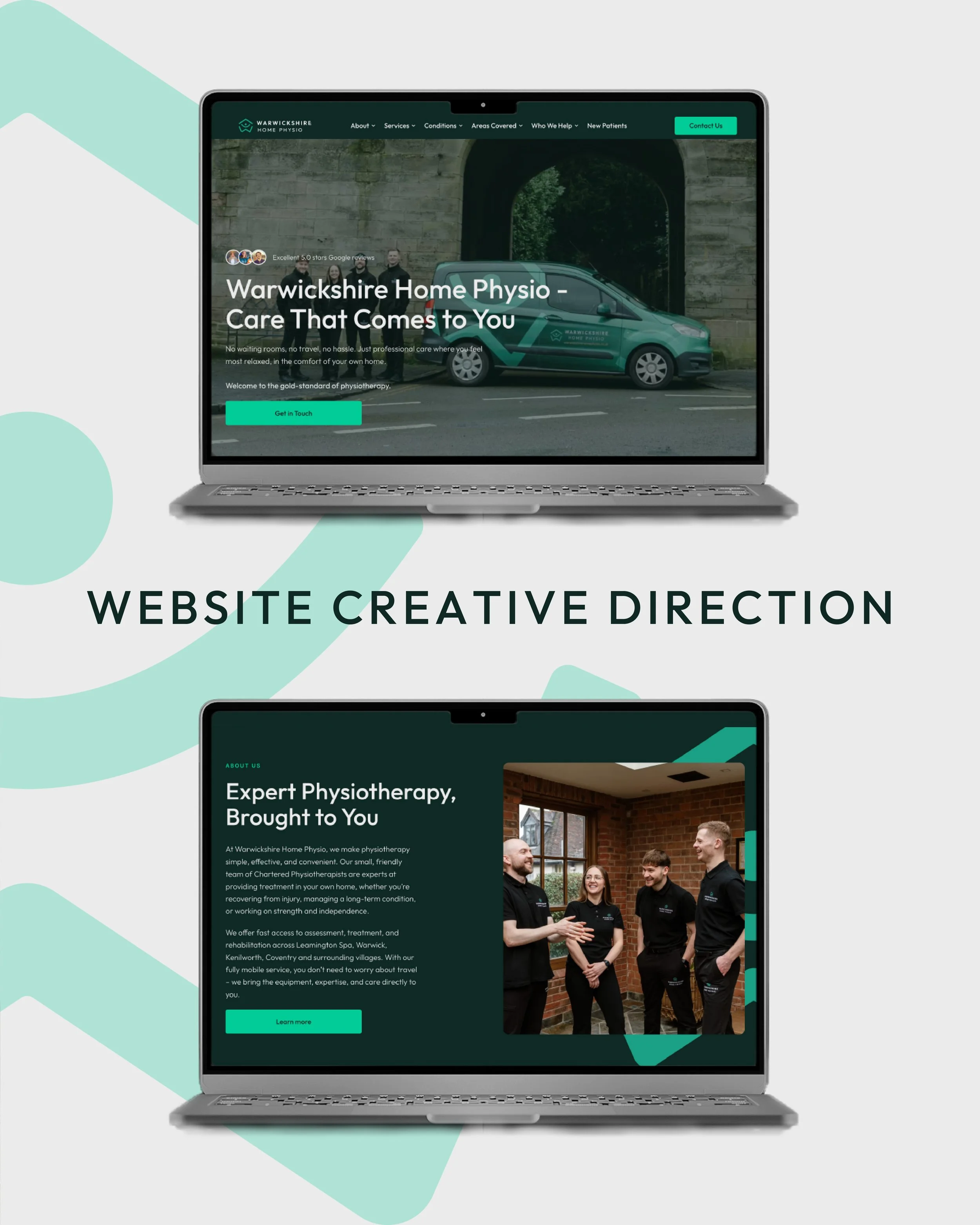
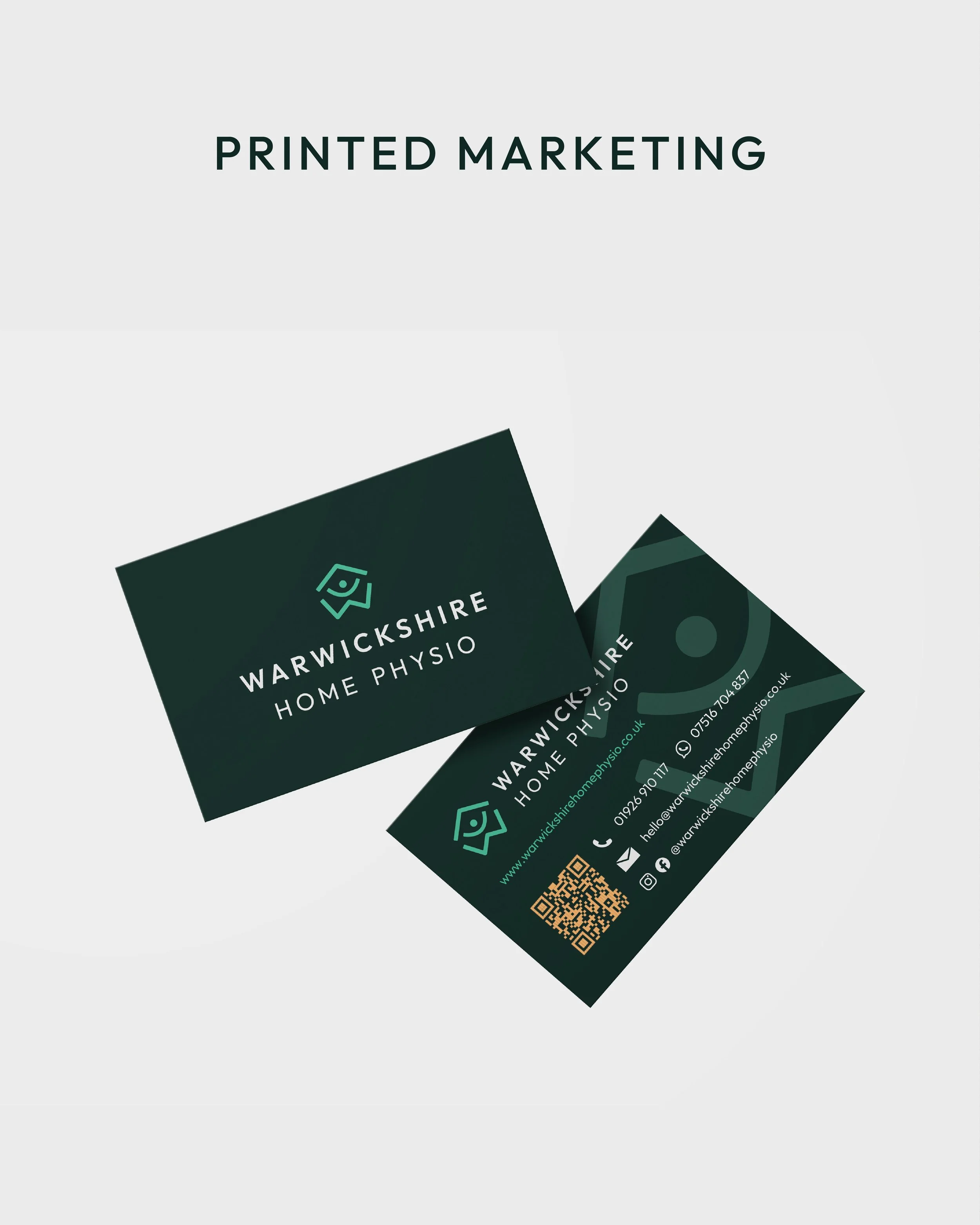
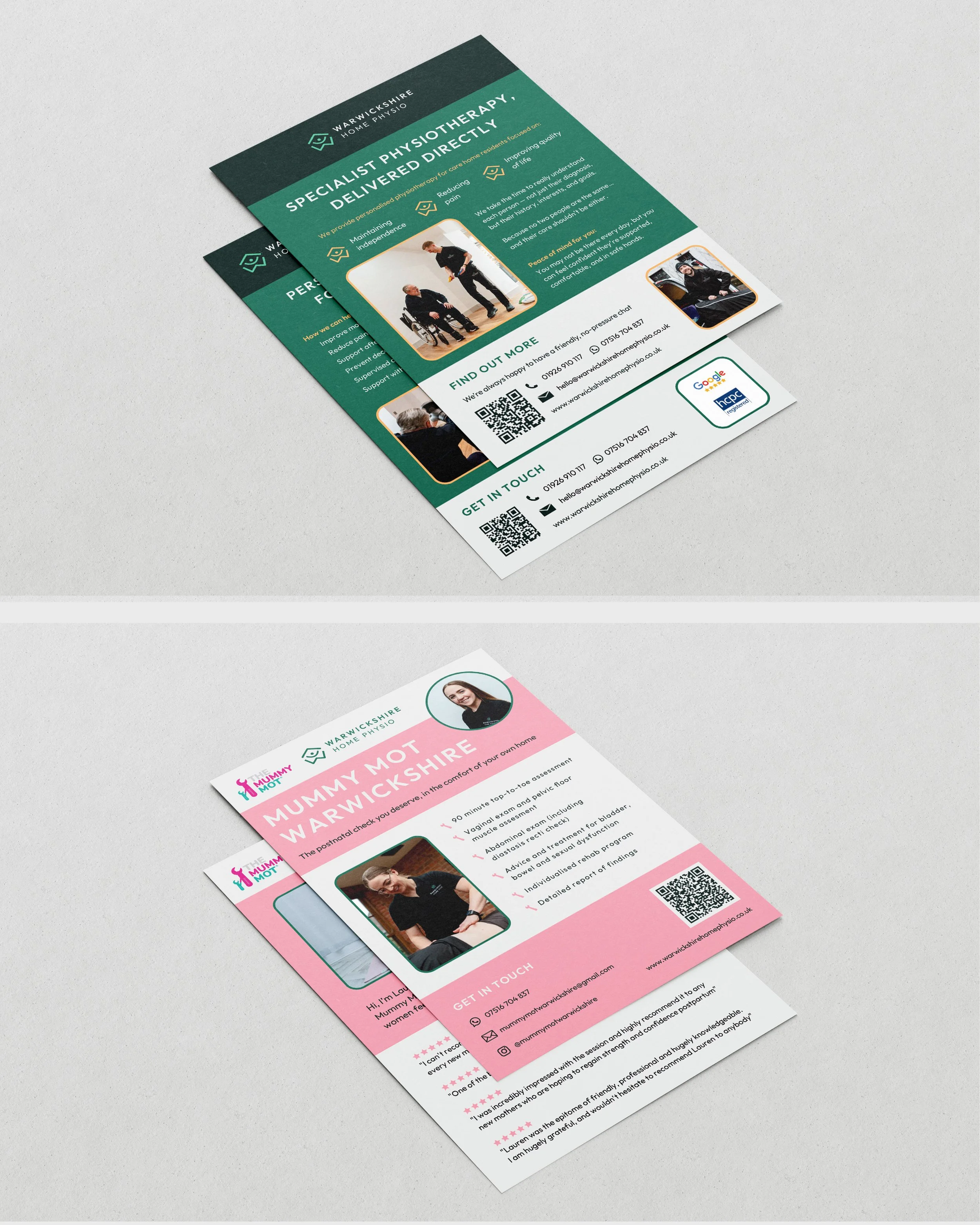
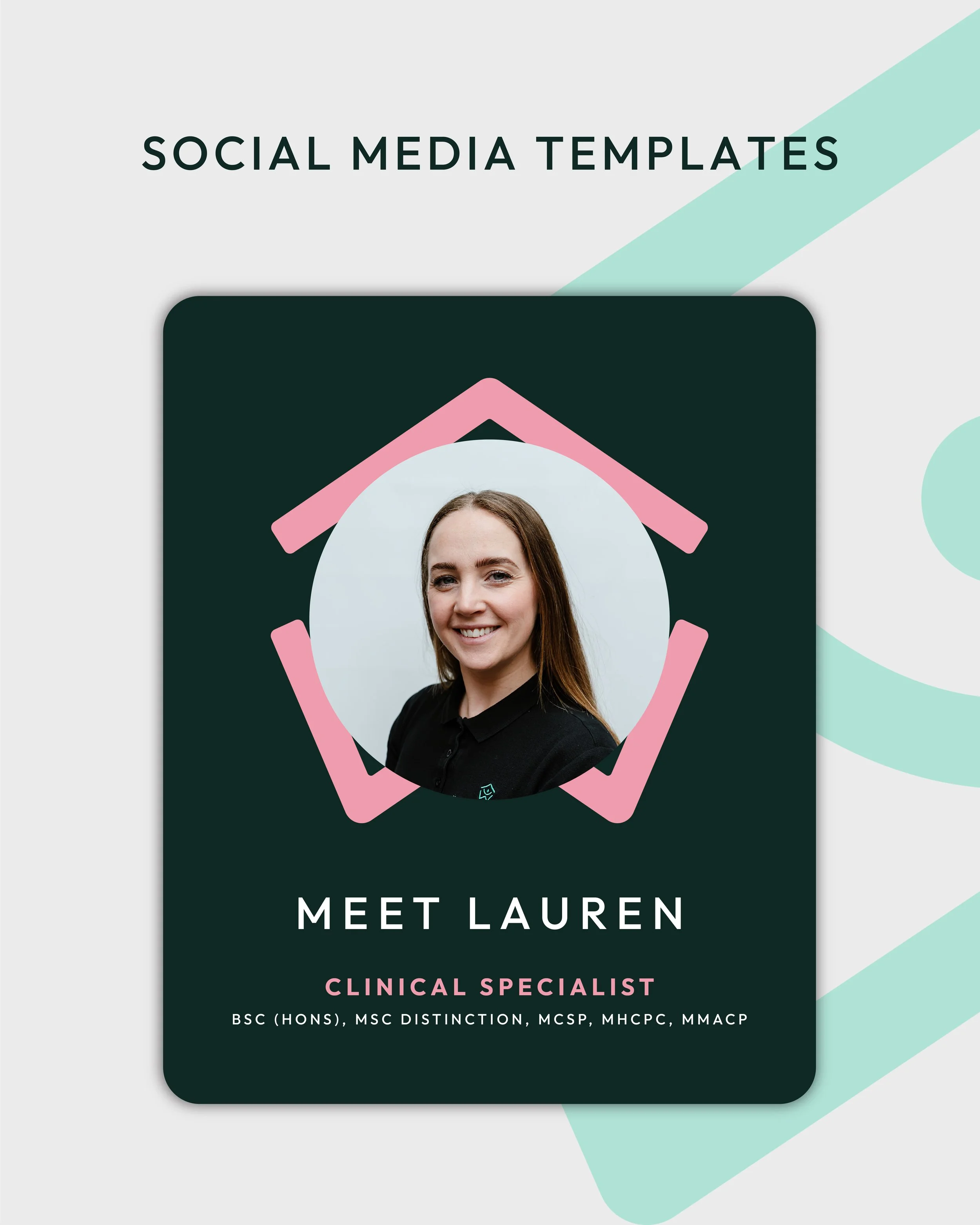
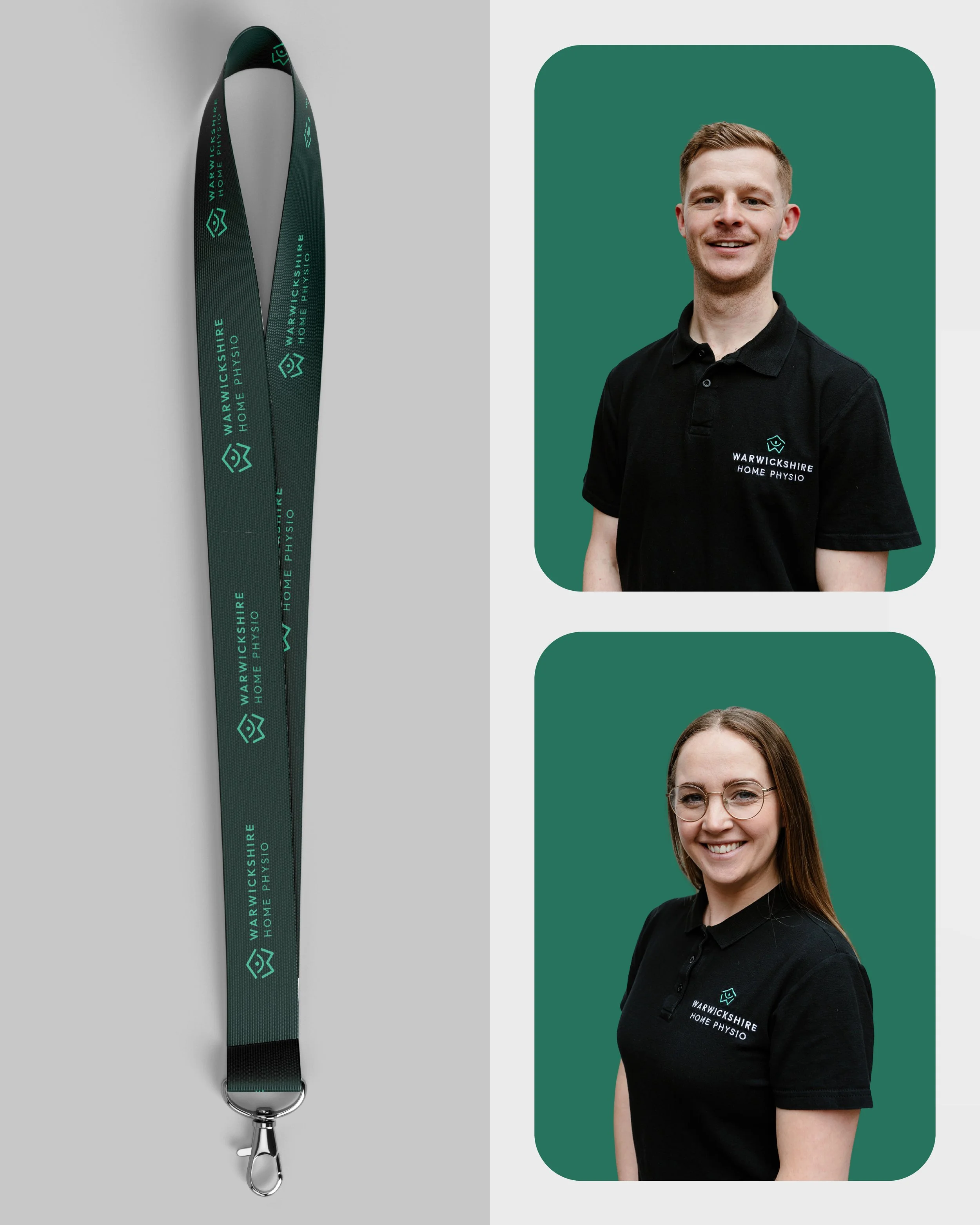
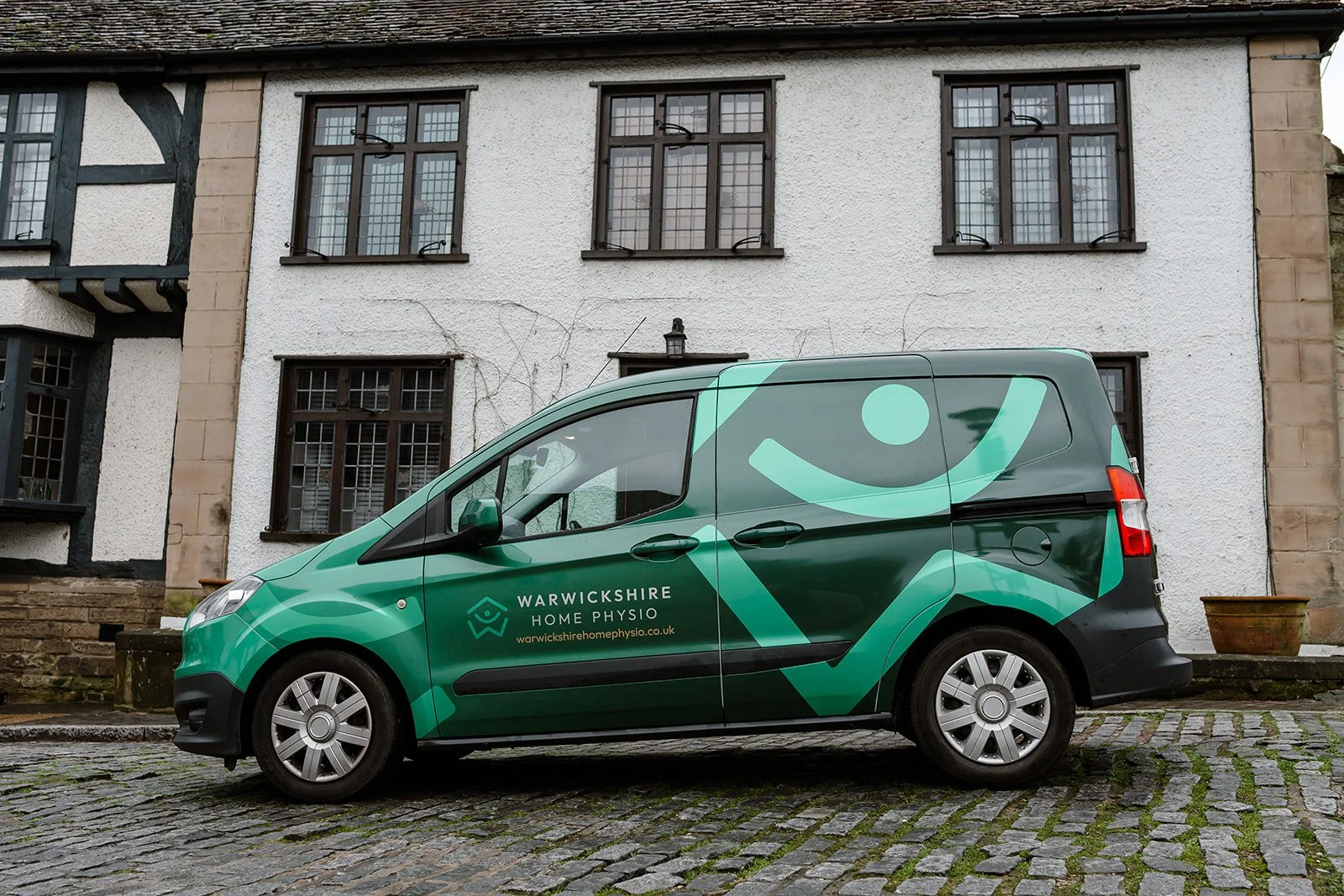
The identity was rolled out across uniforms, full vehicle wraps, business cards, printed marketing, social media templates and website creative direction, creating a consistent and professional presence across physical and digital touchpoints.
Our collaboration continues today, developing new designs and expanding the brand across additional touchpoints to create a more personalised, considered and premium experience for their clients.
A brand designed not just for where the business is today, but where it's heading. And continuing to grow with it.
Ready for your next chapter?
If your business is growing but your branding hasn't quite kept up, let's create an identity that reflects where you are and where you're heading.